Friday, March 17, 2017
Thursday, March 2, 2017
Converting to Wordpress
Hi all,
Just a quick note to let you know I'm in the process of converting to Wordpress. I've transferred by blog posts and comments over but it'll take awhile to get it looking the way I want it to.
The domain name is tiacherie.com (not sure if it's working yet). Alternatively tiacheriefashion.wordpress.com
Will update you with more progress.
New In: B.A.I.T Footwear
Despite my goal of spending less on clothes and shoes this year (which overall has been going well),I had a bit of a splurge online with B.A.I.T Footwear. As you may know I am completely in love with B.A.I.T Footwear. It is without a doubt my favourite brand for shoes and it's got to the point where I almost exclusively wear these shoes. I did a post on my collection awhile ago here but I plan to create an updated version soon.
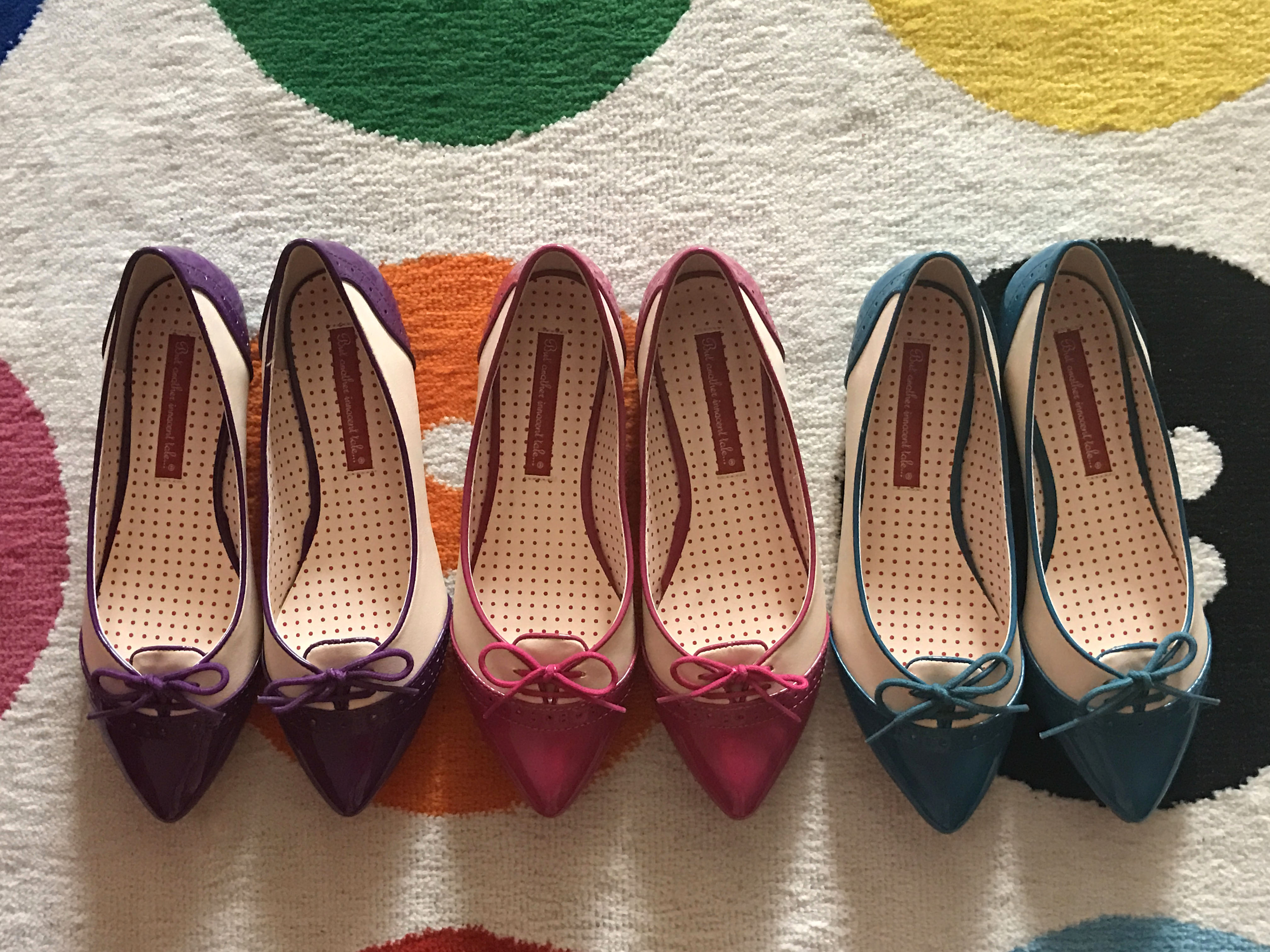
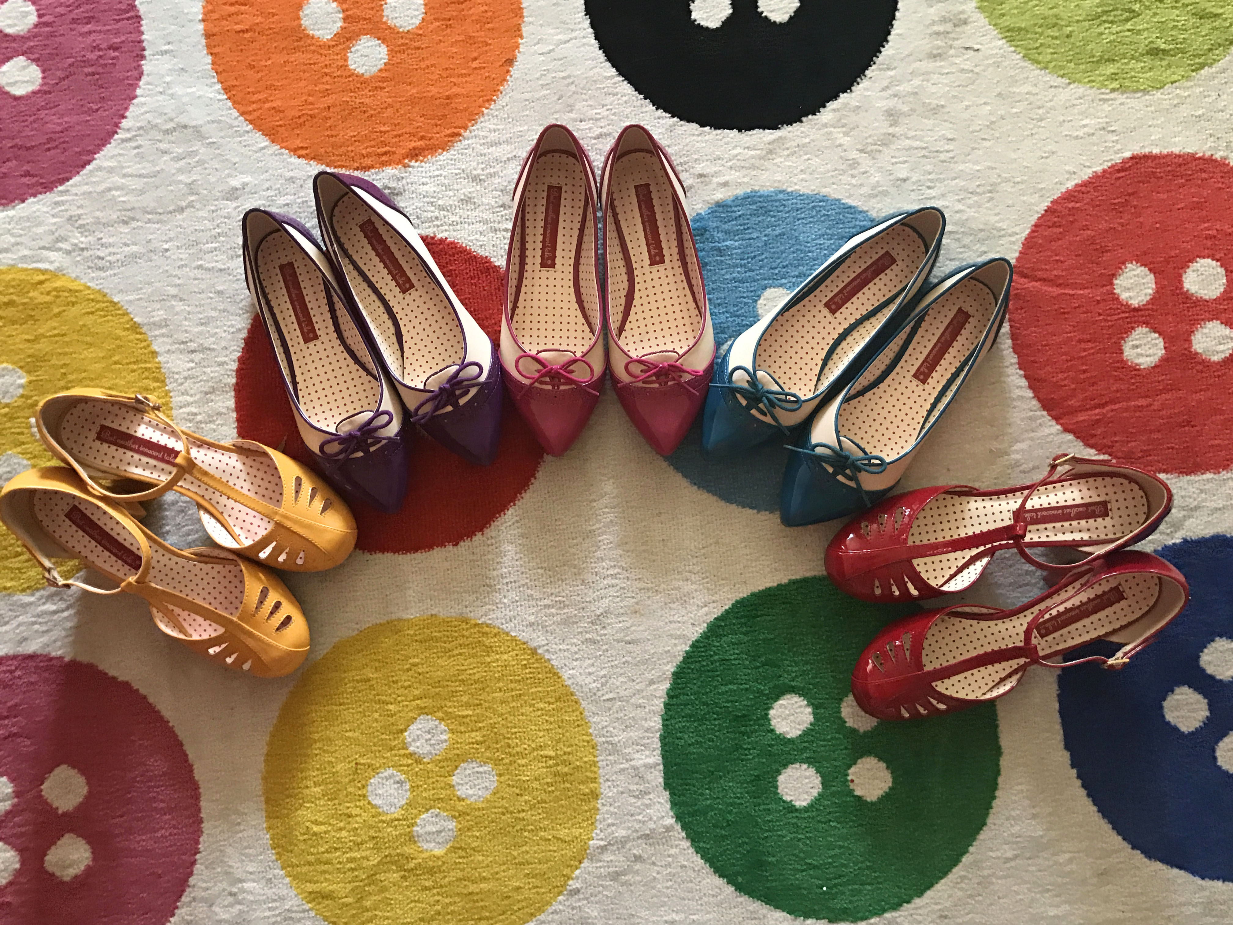
The 'Gloria Flats' are by far my favourite make by B.A.I.T Footwear. Up until now they've only been available in red and in black, which is comparatively limited given most other shoes come in a myriad of colours. I've had so much wear from the Glorias that I've repurchased both the red and the black a couple of times. My favourite outfit with the black version was posted here. I was browsing the website a couple of weeks ago and noticed the Glorias were released in purple, pink and teal. It was a dream come true. I couldn't not buy them considering they are my go to shoe and I know I'll get so much use from them. I can't think of any outfit they wouldn't go with. There are a few items I'd break my spending ban for and I knew that would be a new release Gloria flat, and the same applies to a couple of colour ways in the Wheels and Dollbaby Dita Cardigan.
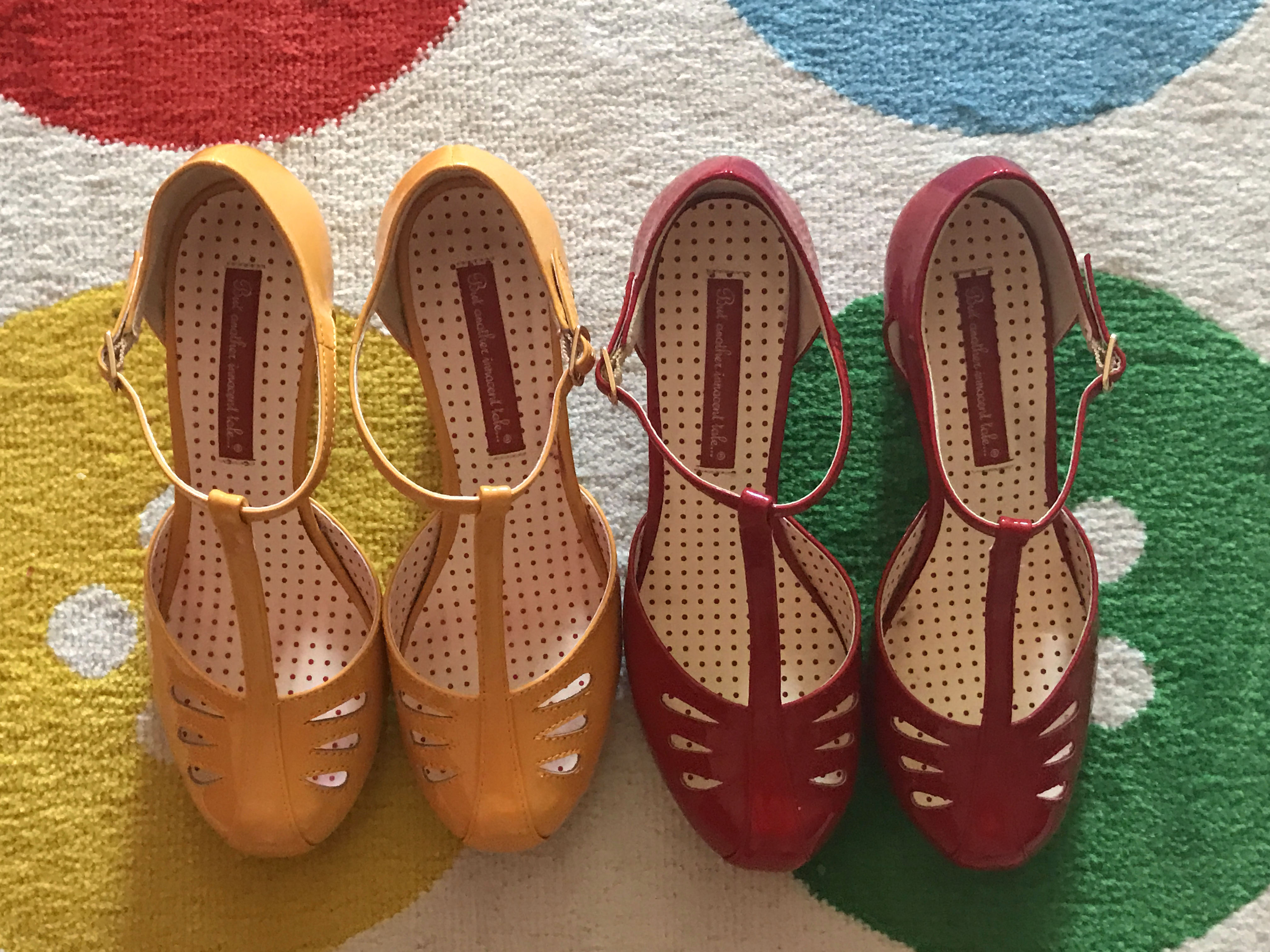
I've lost count how many colours in have of the 'Robbie Heels.' The sparkly blue version is one of my favourites which I posted here. The Robbies are a gorgeous vintage design and are also very comfortable. I couldn't resist the mustard yellow because that's got to be one of the coolest shades in the world! I was also drawn in by the red version because it's such a classy deep red shade and I love the patent finish. Now I want the Robbies in teal and in pink.
Isn't it amazing wearing new shoes?! My motivation to go to work last week was higher than usual because I was wearing the pretty coloured Glorias and Robbies!
I purchased these shoes directly from the B.A.I.T Footwear website. I'm often asked where to buy this brand in Australia but to be honest there aren't many options. Any online store I've seen based in Australia just has such a limited range of stock. If you're serious about owning this brand go with ordering directly from the US. Yes, the postage is crazy high (I hate to think how much I've spent on postage over the years) but I love the shoes so much I consider it worth it. I placed my order on a Thursday night and it arrived only a few days later on the Monday morning. I'm impressed a package can come from the US to Australia that quickly for any price!
Available from B.A.I.T Footwear
The 'Gloria Flats' are by far my favourite make by B.A.I.T Footwear. Up until now they've only been available in red and in black, which is comparatively limited given most other shoes come in a myriad of colours. I've had so much wear from the Glorias that I've repurchased both the red and the black a couple of times. My favourite outfit with the black version was posted here. I was browsing the website a couple of weeks ago and noticed the Glorias were released in purple, pink and teal. It was a dream come true. I couldn't not buy them considering they are my go to shoe and I know I'll get so much use from them. I can't think of any outfit they wouldn't go with. There are a few items I'd break my spending ban for and I knew that would be a new release Gloria flat, and the same applies to a couple of colour ways in the Wheels and Dollbaby Dita Cardigan.
I've lost count how many colours in have of the 'Robbie Heels.' The sparkly blue version is one of my favourites which I posted here. The Robbies are a gorgeous vintage design and are also very comfortable. I couldn't resist the mustard yellow because that's got to be one of the coolest shades in the world! I was also drawn in by the red version because it's such a classy deep red shade and I love the patent finish. Now I want the Robbies in teal and in pink.
Isn't it amazing wearing new shoes?! My motivation to go to work last week was higher than usual because I was wearing the pretty coloured Glorias and Robbies!
I purchased these shoes directly from the B.A.I.T Footwear website. I'm often asked where to buy this brand in Australia but to be honest there aren't many options. Any online store I've seen based in Australia just has such a limited range of stock. If you're serious about owning this brand go with ordering directly from the US. Yes, the postage is crazy high (I hate to think how much I've spent on postage over the years) but I love the shoes so much I consider it worth it. I placed my order on a Thursday night and it arrived only a few days later on the Monday morning. I'm impressed a package can come from the US to Australia that quickly for any price!


Available from B.A.I.T Footwear
Friday, February 24, 2017
Outfit
Another red and green outfit, I told you I love this colour combination. This outfit is the reverse of the one I posted earlier in the week- red on green instead of green on red. I like the way this outfit turned out. It wasn't planned, it came together in a rush before work. I also like how this outfit combines a couple of old favourites. I've had the cardigan for probably five years now and there wouldn't be many pieces in my wardrobe I'm still wearing from that long ago. (Back in the days I when had short brown hair). I like the frill detail and the silver buttons. It's such a nice deep shade of red too. Red is actually incredibly versatile to me. I could accessorise pretty much any dress in my wardrobe with red details.I did a remix post on this cardigan a few years ago here. The mint green lace dress is another old favourite. I've had it for a similar length of time. It's from Portmans and I was so surprised to find it in that store. It seems different to the usual Portmans style and I rarely go into the store. However, I've had so much wear from this dress and will continue to do so. Isn't it incredible how much clothes can remind us of certain times in our lives. In this case, not the best times as my life wasn't easy five years ago. However, the way clothes bring back such vivid memories is quite remarkable.
My shoes are a much more recent purchase. I've been cutting down the spending this year. However, these shoes are one of the few items I've purchased. I've mentioned a few times how I'm a major fan of B.A.I.T Footwear. The vintage designs are unrivaled by other brands and they are very comfortable. I've built up quite a collection now (hoping to do an post on my updated collection soon). I have the Robbies in a few different colours now and when they were released in red I simply couldn't resist. I've noticed Kitten D'Amour appear to have replicated a few B.A.I.T Footwear designs now including the Robbies. I'm not sure the background on it but from my perspective I'm not a fan of the replication. Now I have the red version of the Robbies from B.A.I.T Footwear I appreciate how much better they are; a much classier deeper shade of red, patent and overall better quality.
Thanks so much for your advice regarding my photos being stolen on ebay. It was very helpful and I really appreciate it!
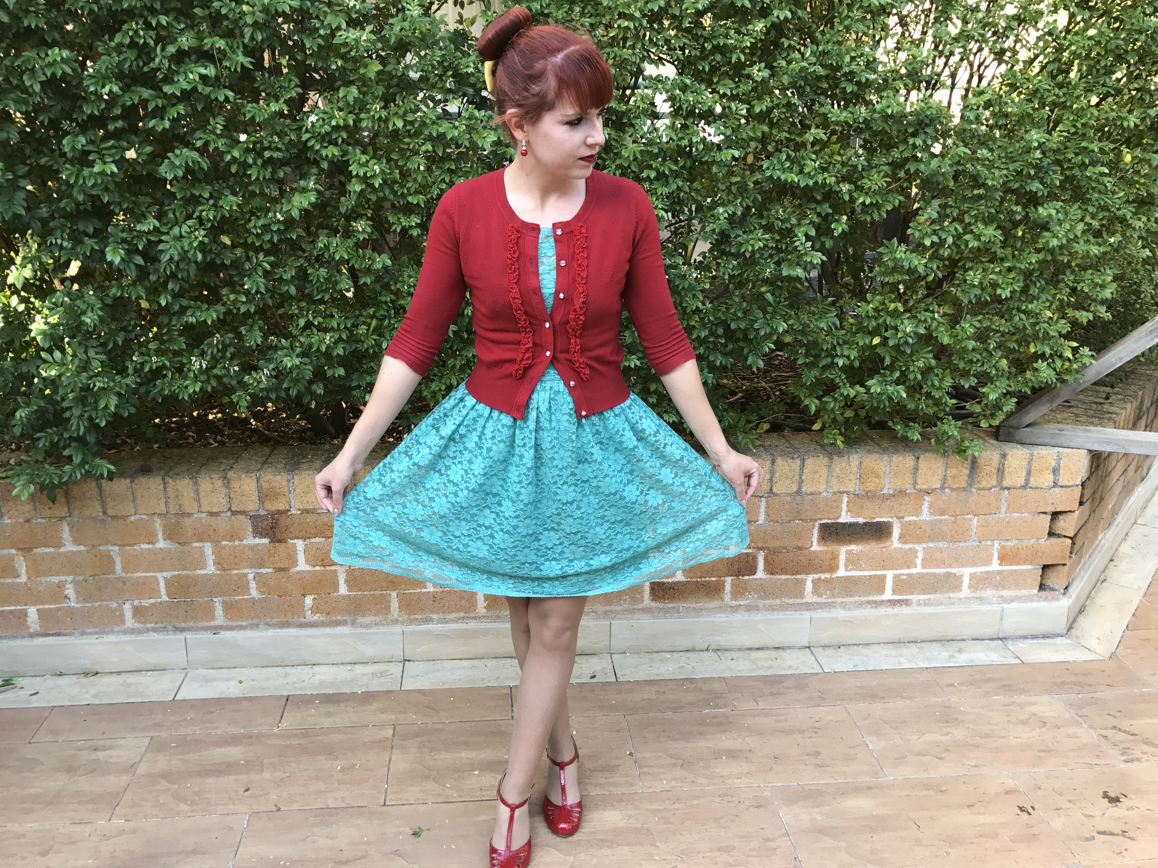

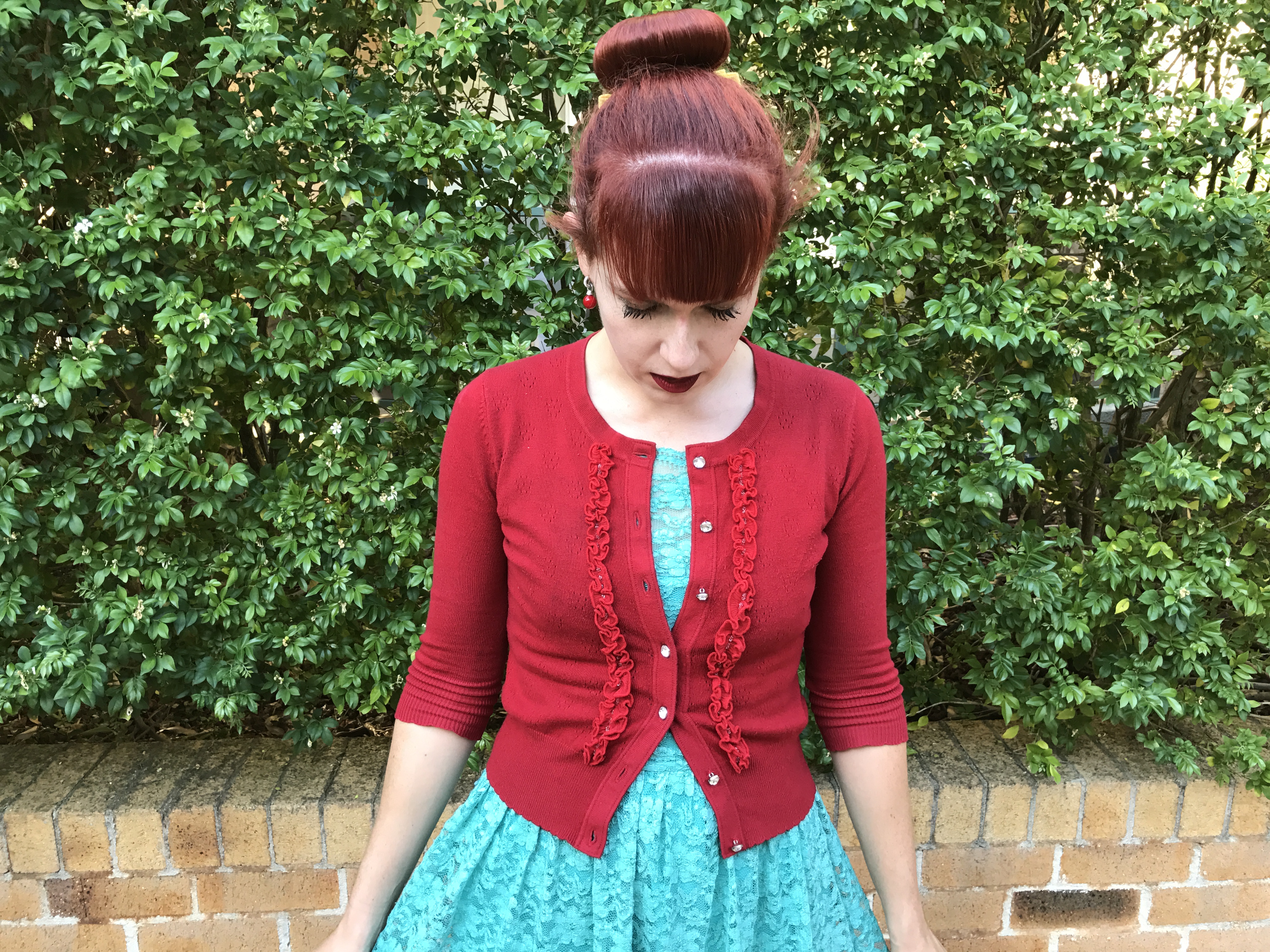

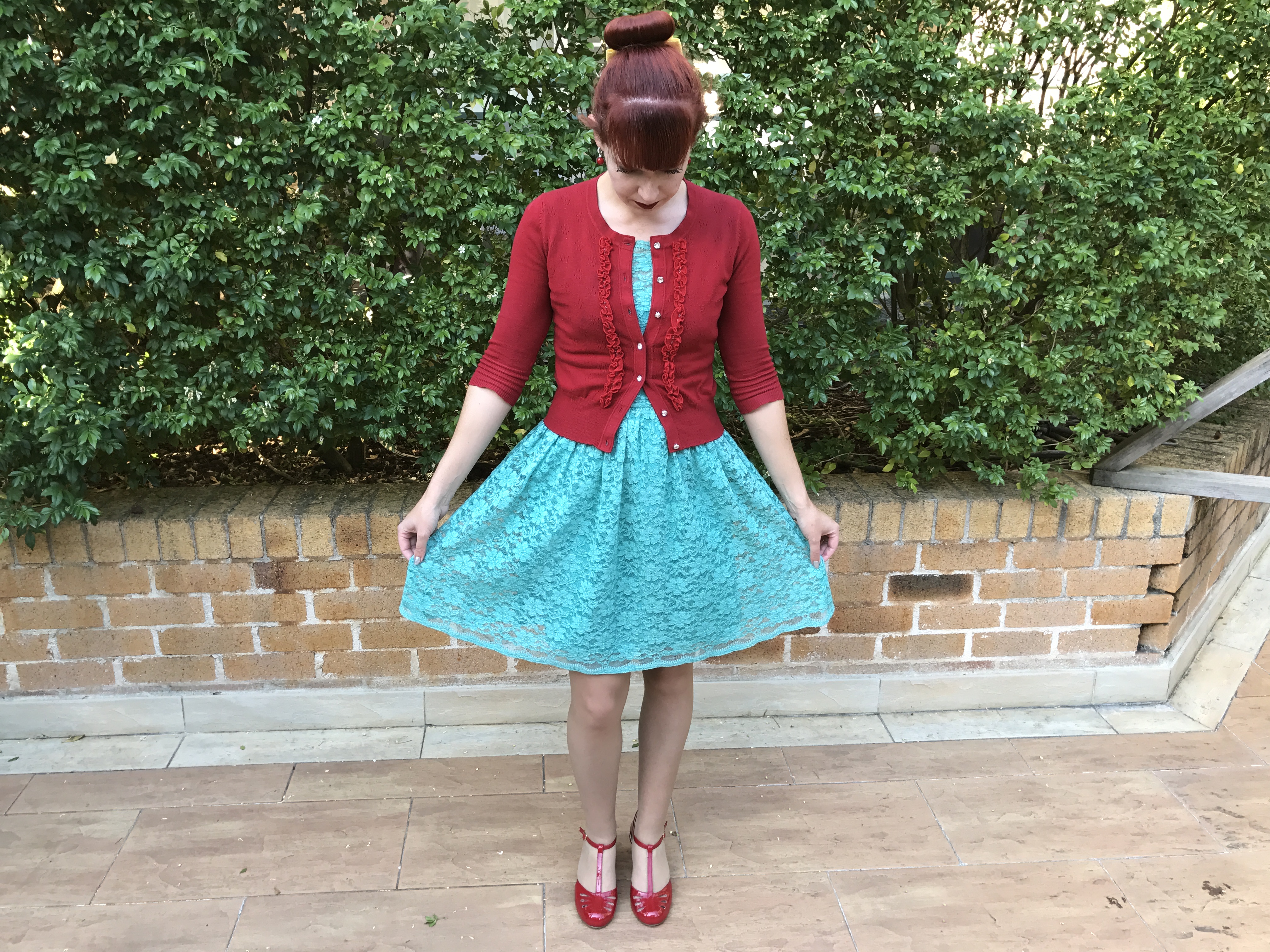
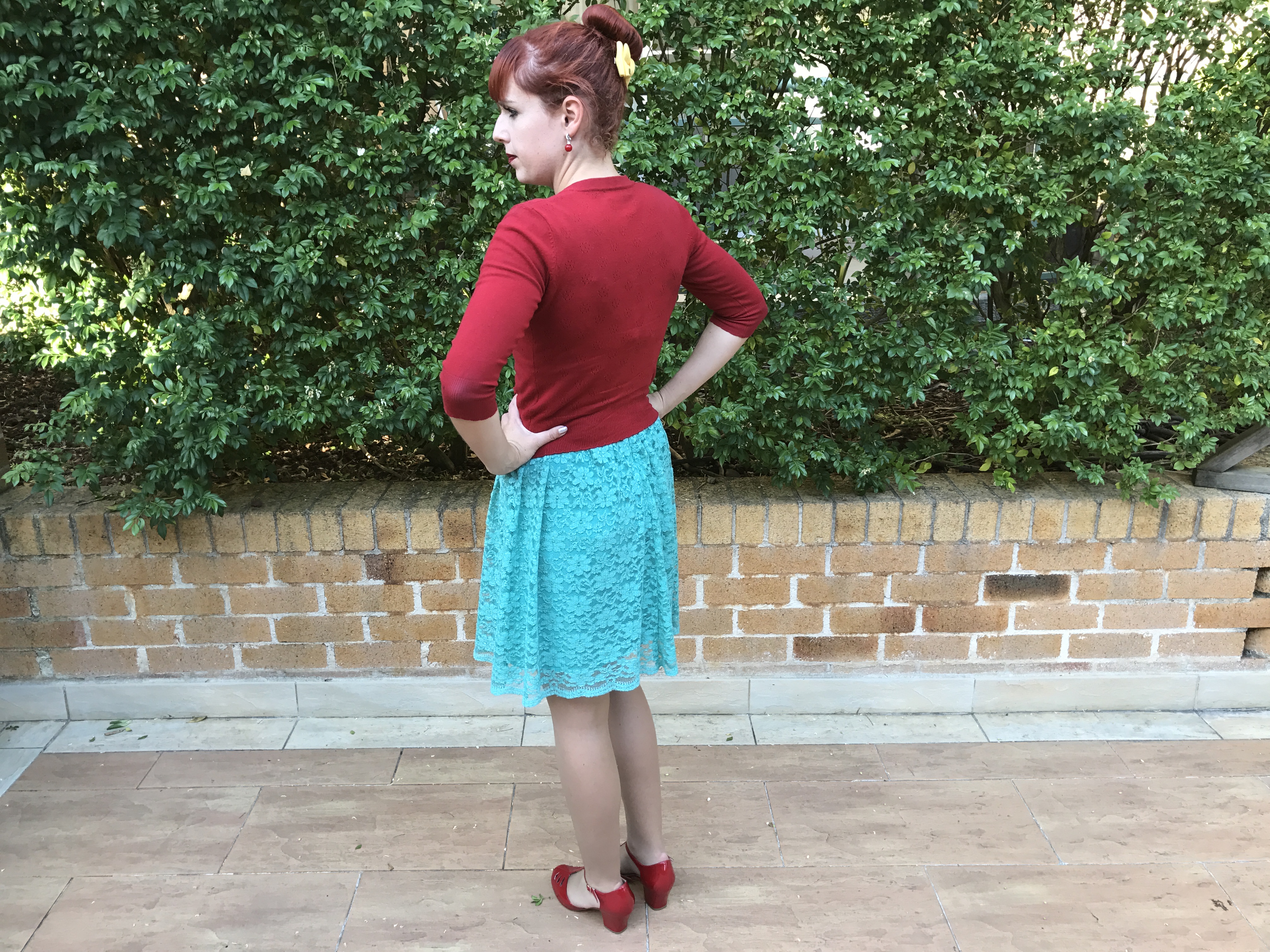
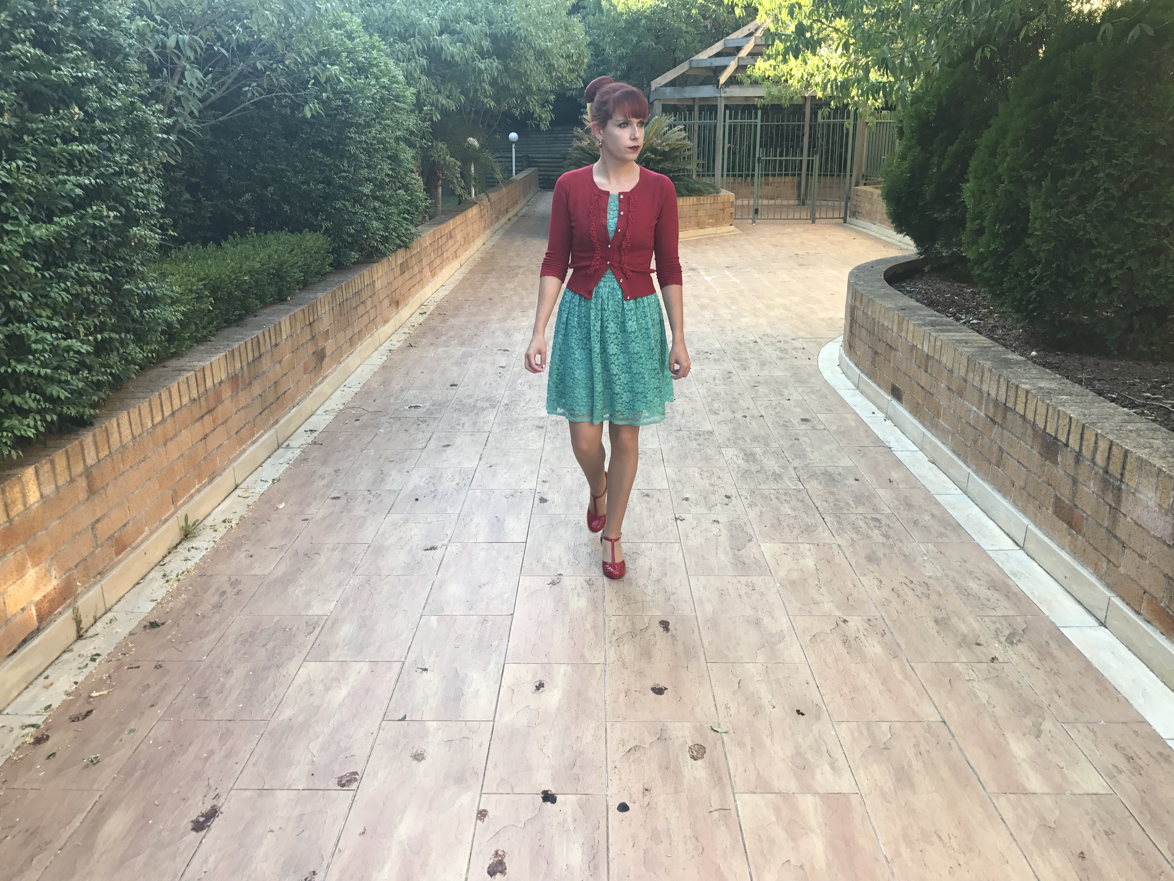
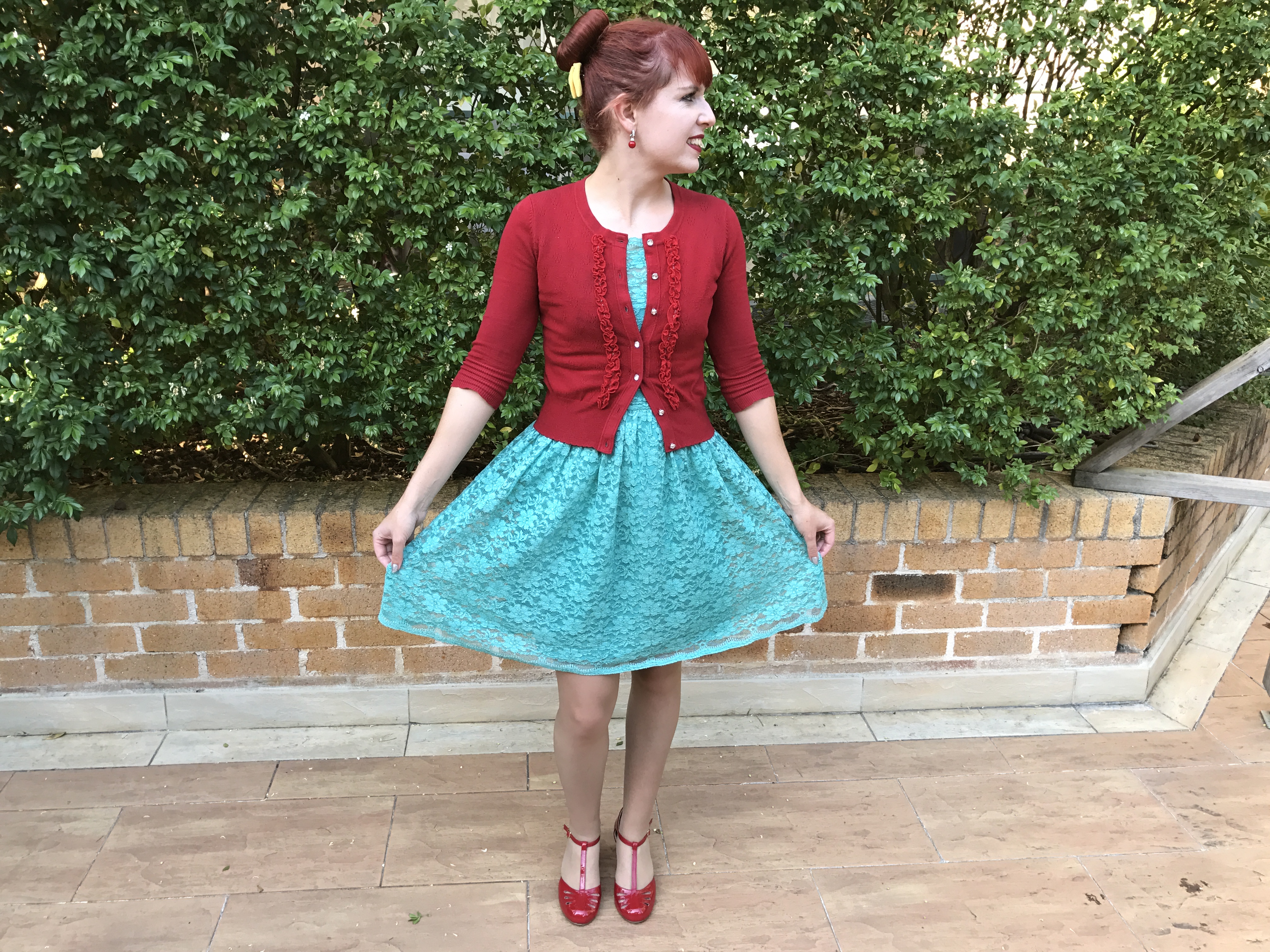
B.A.I.T Footwear Robbie Heels in Red Patent
Portmans Lace Dress
Alannah Hill You Gossip Cardigan
Hair Bow (gifted from my sister)
My shoes are a much more recent purchase. I've been cutting down the spending this year. However, these shoes are one of the few items I've purchased. I've mentioned a few times how I'm a major fan of B.A.I.T Footwear. The vintage designs are unrivaled by other brands and they are very comfortable. I've built up quite a collection now (hoping to do an post on my updated collection soon). I have the Robbies in a few different colours now and when they were released in red I simply couldn't resist. I've noticed Kitten D'Amour appear to have replicated a few B.A.I.T Footwear designs now including the Robbies. I'm not sure the background on it but from my perspective I'm not a fan of the replication. Now I have the red version of the Robbies from B.A.I.T Footwear I appreciate how much better they are; a much classier deeper shade of red, patent and overall better quality.
Thanks so much for your advice regarding my photos being stolen on ebay. It was very helpful and I really appreciate it!


B.A.I.T Footwear Robbie Heels in Red Patent
Portmans Lace Dress
Alannah Hill You Gossip Cardigan
Hair Bow (gifted from my sister)
Monday, February 20, 2017
Outfit
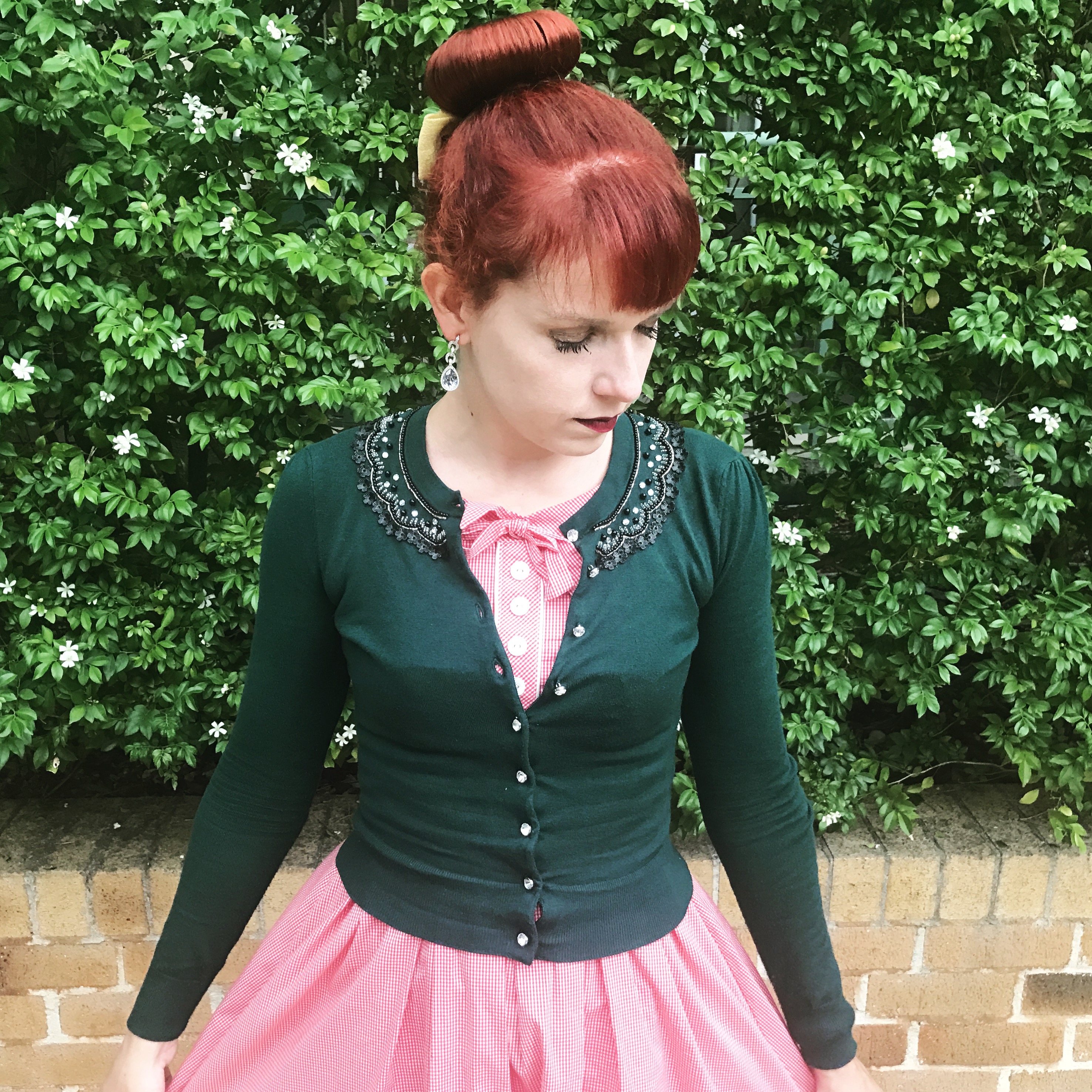 Wow it's been so long since I did an outfit post, it's actually my first set of pictures taken all year. In addition to being incredibly busy (which you can read about on my fitness blog here), I hadn't dyed my hair in months and my regrowth was so terrible it was all the way back to my bun. I had a few people ask whether it was intentional ombre! Therefore, I'd been avoiding outfit pictures and cameras in general. I finally had my hair dyed again this weekend. I must never let it get so bad again. Red hair and a routine of swimming six days a week isn't easy. But I love both red hair and swimming so I make it work the best I can.
 The Kitten D'Amour Picture Perfect dress has easily become my most worn and go to dress. I'm often in a rush for work after training in the mornings so I reach for this dress time and time again. It's so simple to pair with any of my cardigans. I wish I had the blue version of the dress too. I've said many times before that red and green is such an underrated colour scheme. It certainly shouldn't just be reserved for Christmas. I wear these colours together frequently (such as here and here on the blog). Green is supposed to be good with red hair also.
On another note I'm so frustrated by seeing my personal pictures, taken entirely for the purposes of this blog, used on other people's ebay listings. It's happened quite a few times including right now for the Emerald Green Dita Cardigan. I cannot comprehend why anyone would think that's acceptable. Use some common sense. Just take your own pictures!! I'm also incredibly frustrated by the responses received when I ask the ebay seller to take my pictures down. How can the fact my images show up in a google search, be used as a justification for using them? How can my personal blog photos be compared to using actual stock photos from a website? There's no need to respond in such a manner. Have you ever experienced this, any tips of what to do?
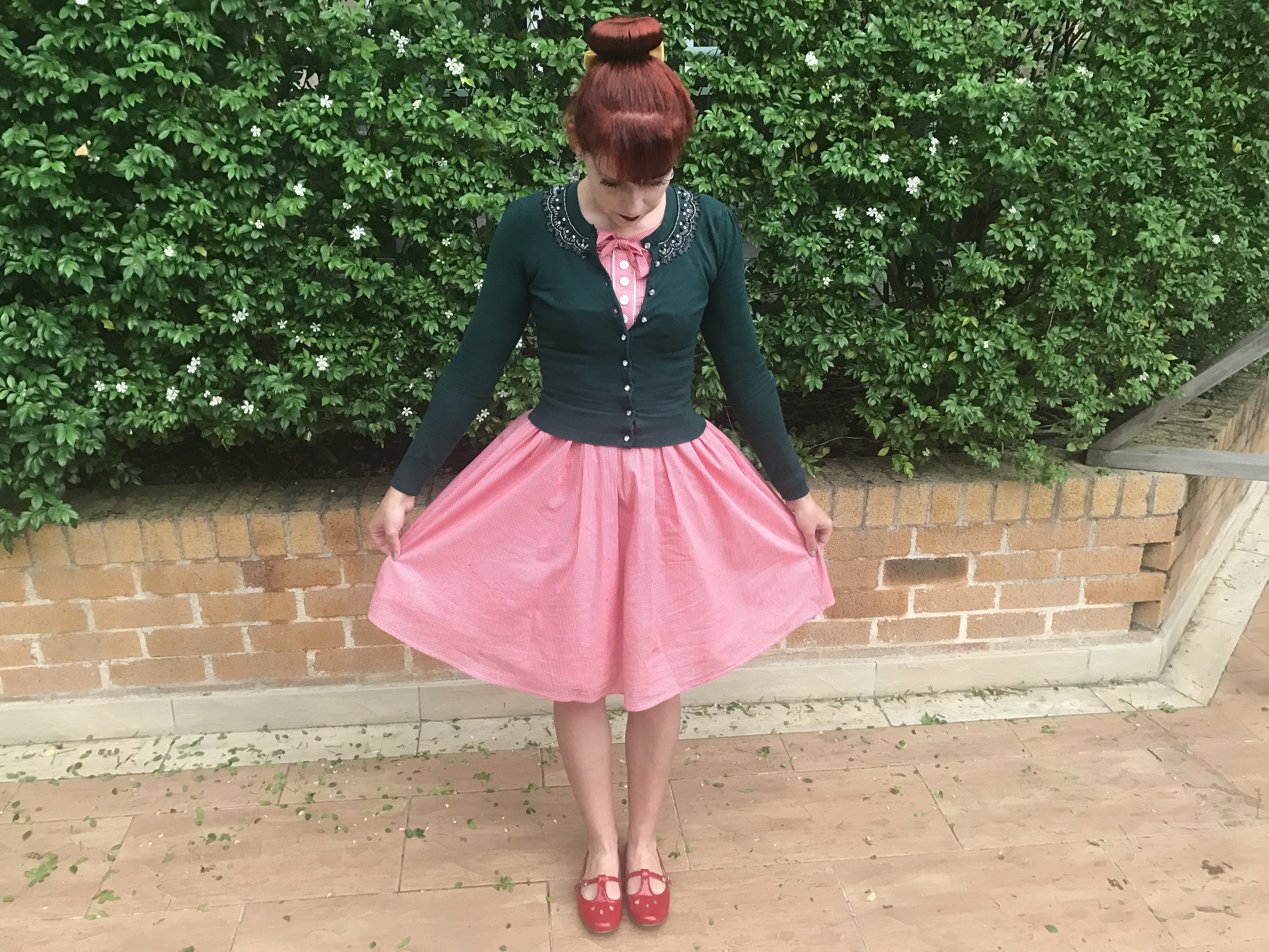
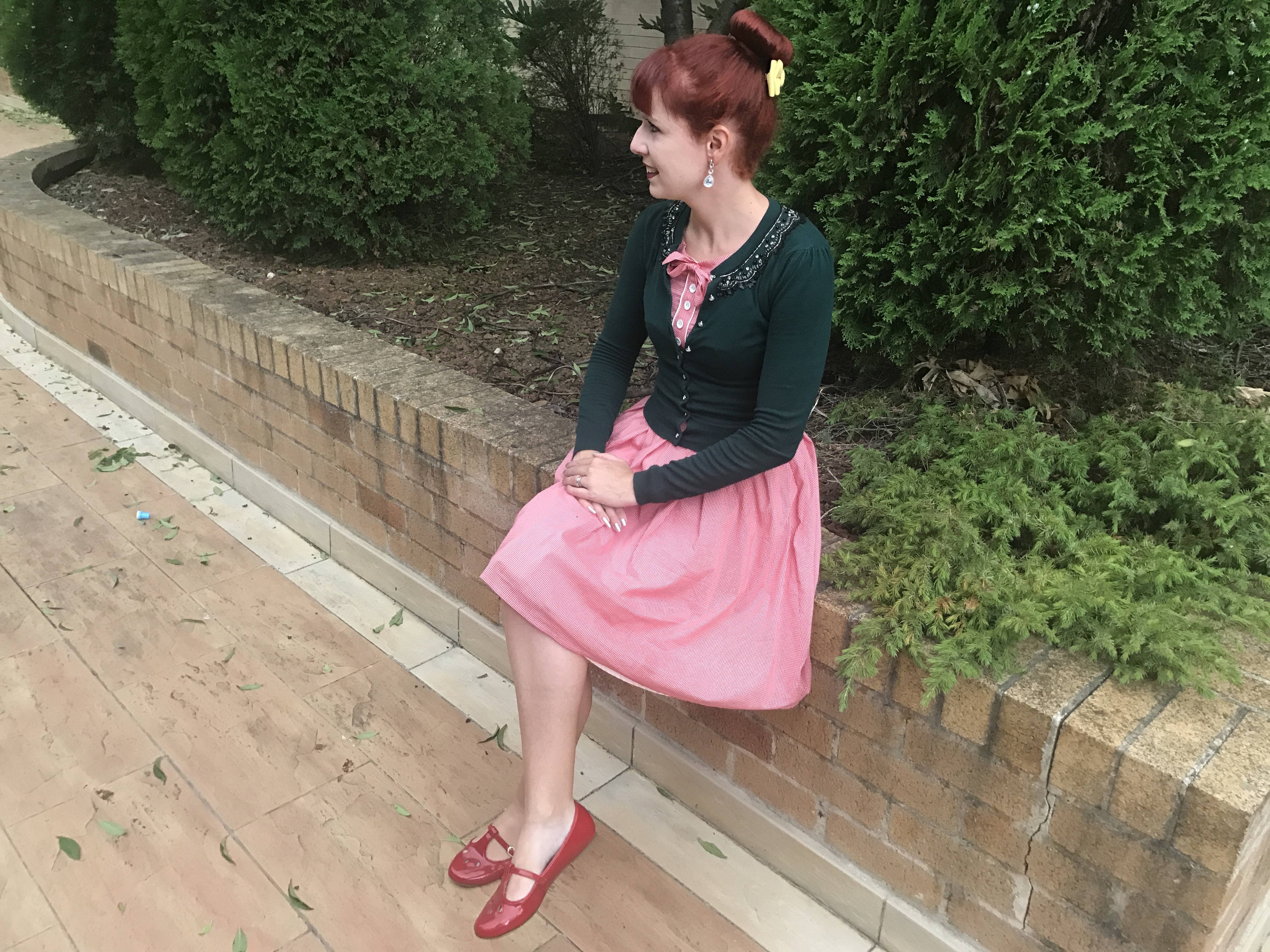
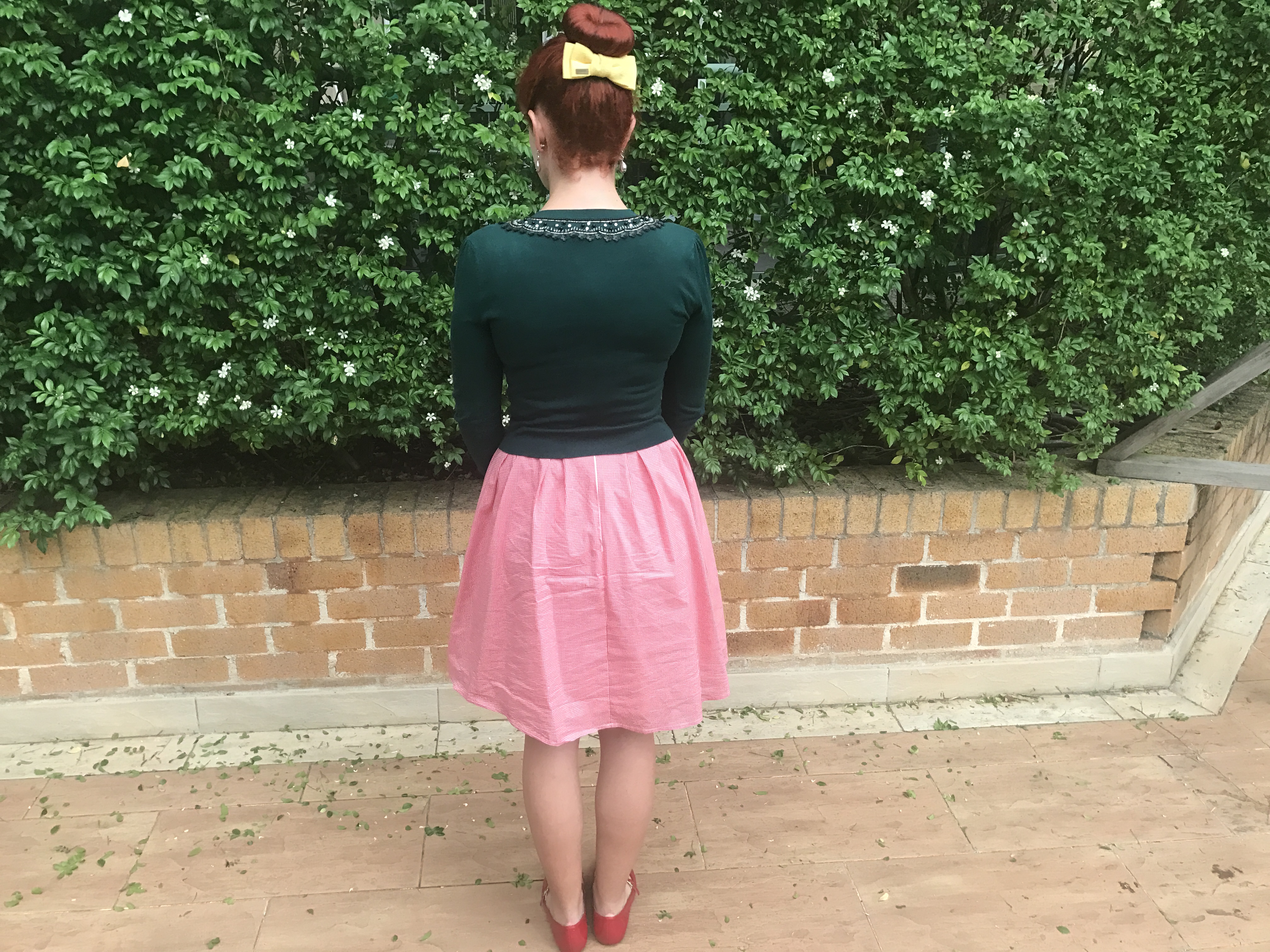
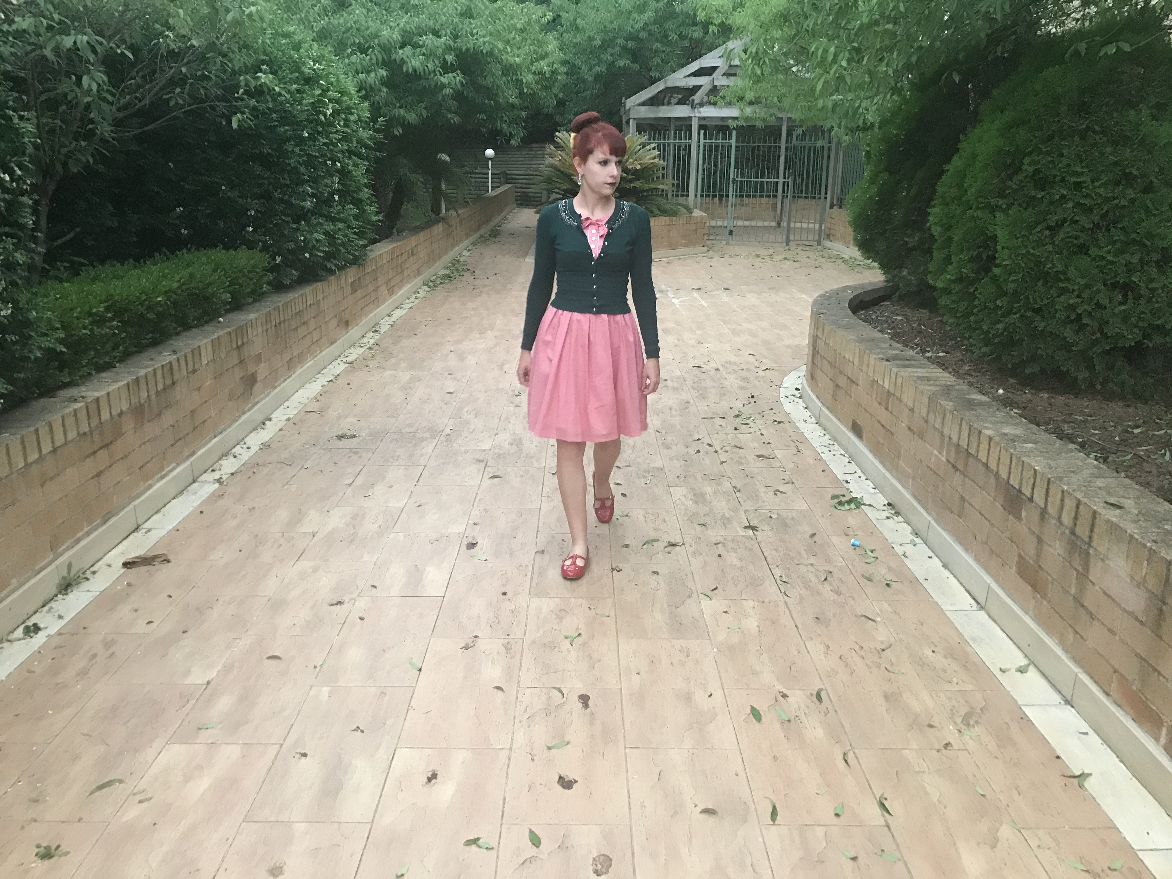
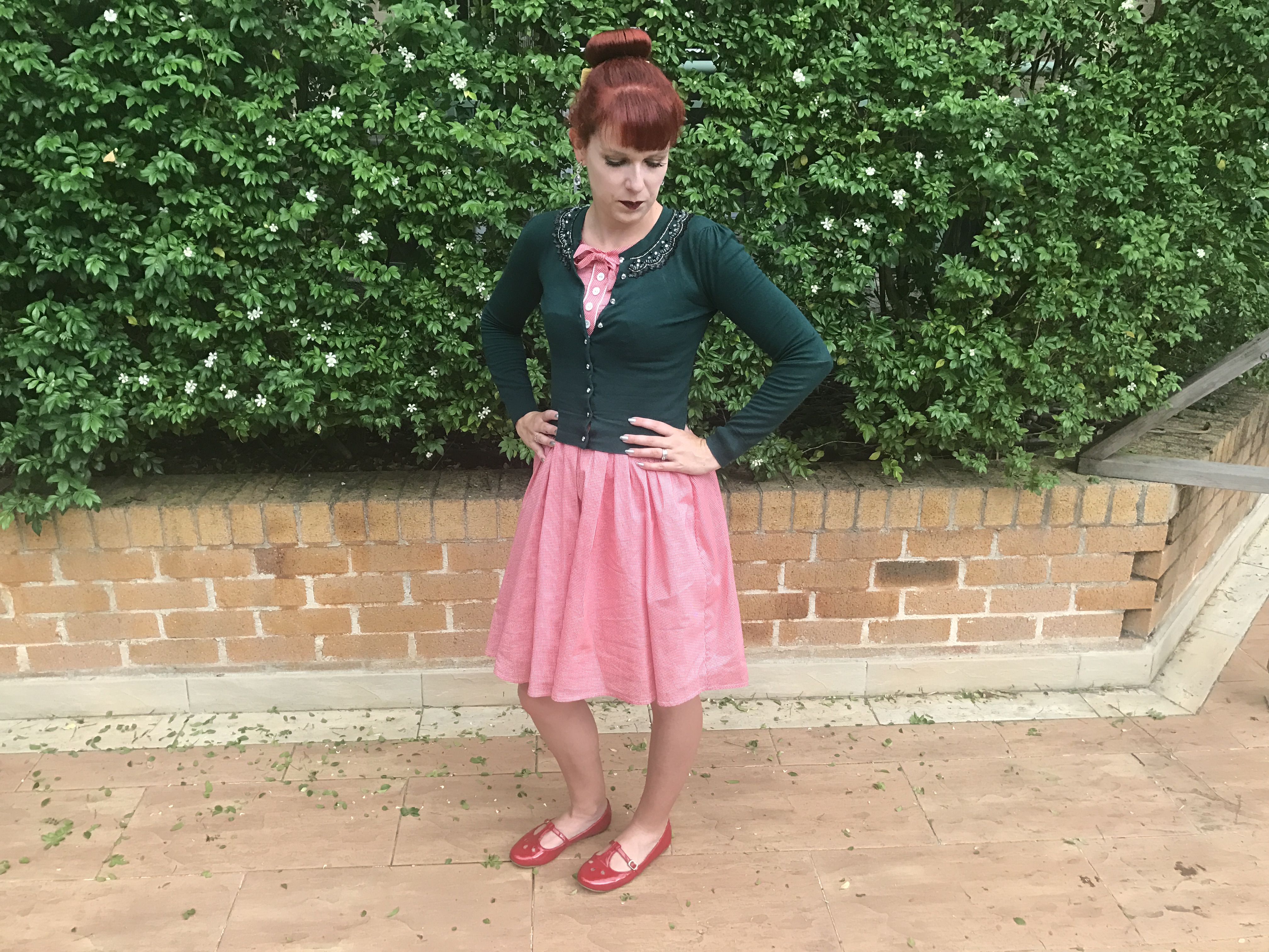
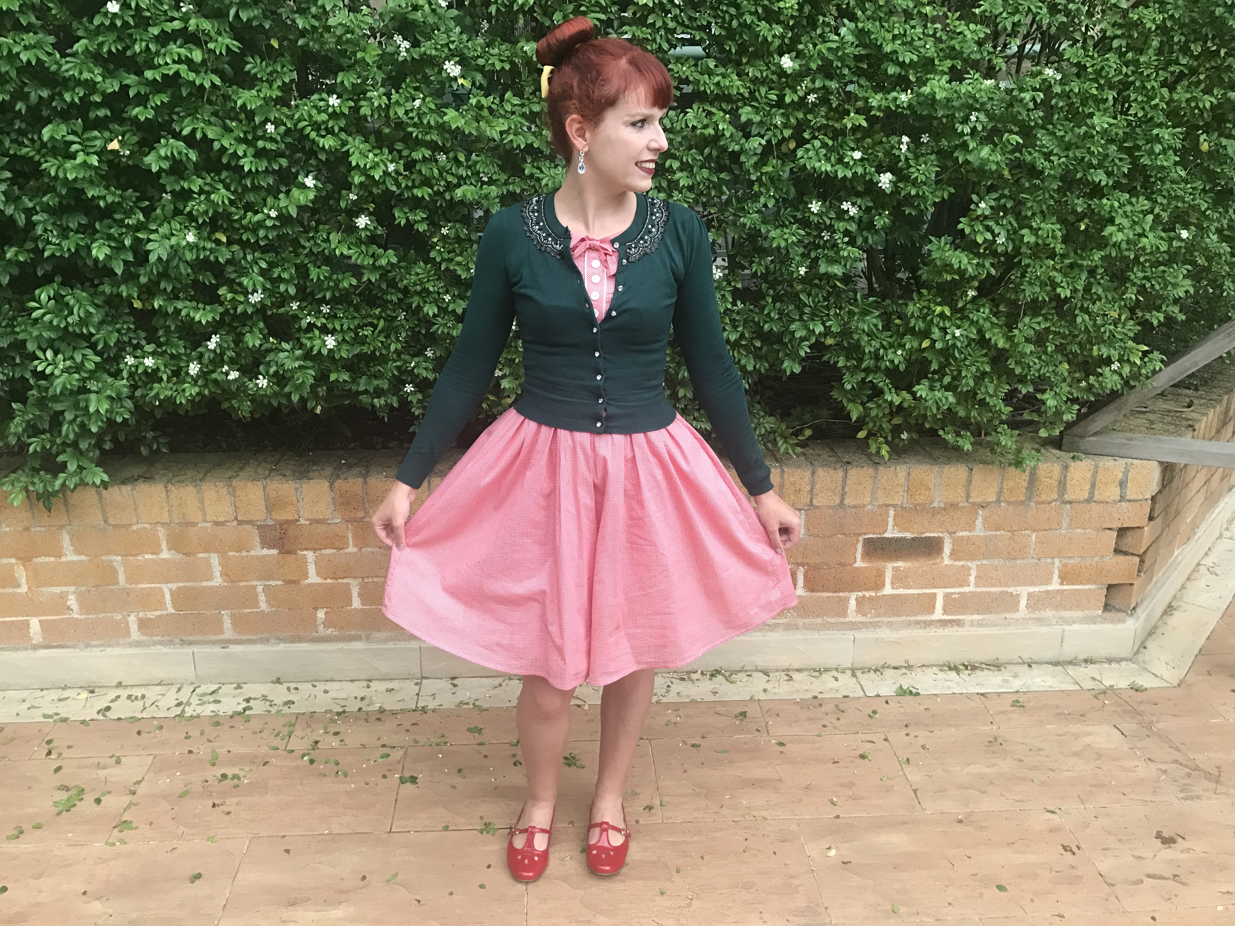
Kitten D'Amour Picture Perfect Dress
B.A.I.T Everline Flats in Red
Alannah Hill Once Upon A Dream Cardigan in Emerald
Hair Bow (gifted from my sister!)
Labels:
Alannah Hill,
B.A.I.T Footwear,
Kitten D'Amour,
Outfits
Thursday, February 2, 2017
Current Loves
Alannah Hill My Summer Glow Cardigan
I've always loved stripes, bows and the combination of red, white and blue so this is certainly my style. It's a classic design but also a little different because most of the cardigans at Alannah Hill are solid rather than patterned. My only concern is the large composition of cotton. I usually avoid buying cotton cardigans because of how they lose shape and I don't like the feel of the material. It's not completely cotton so I'd have to see what this cardigan is like in person.
Kate Spade Be Mine Wallet
Today I had to go into the city to collect my race kit for the weekend (running event and ocean swim) and while I was there I went into the Kate Spade store. I rarely go to Sydney Westfield so visiting the Kate Spade store was a treat. It was amazing! The store is so pretty and sparkly. The Valentines collection is so beautiful and I've always liked heart print. I found so many pieces I wanted to buy. Without going on a massive shopping spree I could probably justify purchasing a wallet but I'll wait until my birthday because I'm trying to get out of the habit of spending just because I see something I like.
Nike Free Rn Shoes
I already have the Nike Free Rn in a few different colours and I'm very impressed with them (I'll write a separate post about them on my fitness blog eventually). They are running shoes but I wear them for bootcamp, to tennis and to and from swimming. I love the minimalist and lightweight design and they are very comfortable. The bright colour range is also a feature and, at the moment, the Free Rn is available in 13 different colours on the Nike website. I desperately want to add this pink and blue version to my collection but I'm spending less at the moment so resisting the desire to buy more.
Marc Jacobs Shine Fragrance
I discovered this today during a quick trip to Sephora. I was amazed by the pretty metallic packaging in red, gold and pink. It's hard to choose a favourite but overall I think the red was the most pretty in person. As far as I can tell it appears to be the usual Marc Jacobs Daisy fragrance just with different bottles. I've always liked Daisy and I'm running low on it (maybe I'll try and get some for my birthday next month). I can still smell the scent on me which I sampled earlier today. So pretty. Knowing me, I'd probably find some excuse to own all three colours.
Alannah Hill Only in Your Dreams Cardigan
There are many Alannah Hill cardigans I love at the moment (and as always!) but this one is my favourites because of the unique colour. It's so difficult to find yellow clothes and especially mustard yellow which is unfortunate because it's such a standout shade. It also comes in pink which is also pretty. I adore the detailing and beading.
Kate Spade On Pointe Swan Small Maise Bag
Following on from the Kate Spade theme, I've always wanted a bag. It would be my favourite brand of bag to have (other than Chanel of course!) I love how the bags are so creative; you don't see a swan printed bag every day. To me, it's classic and fun at the same time. I've always liked swans for some reason too. At $489 it's an expensive bag. I'm sure it could be seen as an investment, right!?!!
What's on your wishlist right now?
I've always loved stripes, bows and the combination of red, white and blue so this is certainly my style. It's a classic design but also a little different because most of the cardigans at Alannah Hill are solid rather than patterned. My only concern is the large composition of cotton. I usually avoid buying cotton cardigans because of how they lose shape and I don't like the feel of the material. It's not completely cotton so I'd have to see what this cardigan is like in person.
Kate Spade Be Mine Wallet
Today I had to go into the city to collect my race kit for the weekend (running event and ocean swim) and while I was there I went into the Kate Spade store. I rarely go to Sydney Westfield so visiting the Kate Spade store was a treat. It was amazing! The store is so pretty and sparkly. The Valentines collection is so beautiful and I've always liked heart print. I found so many pieces I wanted to buy. Without going on a massive shopping spree I could probably justify purchasing a wallet but I'll wait until my birthday because I'm trying to get out of the habit of spending just because I see something I like.
Nike Free Rn Shoes
I already have the Nike Free Rn in a few different colours and I'm very impressed with them (I'll write a separate post about them on my fitness blog eventually). They are running shoes but I wear them for bootcamp, to tennis and to and from swimming. I love the minimalist and lightweight design and they are very comfortable. The bright colour range is also a feature and, at the moment, the Free Rn is available in 13 different colours on the Nike website. I desperately want to add this pink and blue version to my collection but I'm spending less at the moment so resisting the desire to buy more.
Marc Jacobs Shine Fragrance
I discovered this today during a quick trip to Sephora. I was amazed by the pretty metallic packaging in red, gold and pink. It's hard to choose a favourite but overall I think the red was the most pretty in person. As far as I can tell it appears to be the usual Marc Jacobs Daisy fragrance just with different bottles. I've always liked Daisy and I'm running low on it (maybe I'll try and get some for my birthday next month). I can still smell the scent on me which I sampled earlier today. So pretty. Knowing me, I'd probably find some excuse to own all three colours.
There are many Alannah Hill cardigans I love at the moment (and as always!) but this one is my favourites because of the unique colour. It's so difficult to find yellow clothes and especially mustard yellow which is unfortunate because it's such a standout shade. It also comes in pink which is also pretty. I adore the detailing and beading.
Kate Spade On Pointe Swan Small Maise Bag
Following on from the Kate Spade theme, I've always wanted a bag. It would be my favourite brand of bag to have (other than Chanel of course!) I love how the bags are so creative; you don't see a swan printed bag every day. To me, it's classic and fun at the same time. I've always liked swans for some reason too. At $489 it's an expensive bag. I'm sure it could be seen as an investment, right!?!!
What's on your wishlist right now?
Friday, January 27, 2017
NYX Soft Matte Lip Cream Review
I recently purchased the NYX Soft Matte Lip Cream Vault which has mini versions of all 36 shades in the collection. I'd wanted to try this range for awhile and I wasn't sure which colours to go for so when the vault was available for a good price, I thought I'd buy that. I've certainly never had so many shades in the one product before. I've also never been so excited by a makeup product. It's been really fun to try shades I wouldn't normally so I thought I'd share my thoughts here. It look me almost an entire day to complete this post!
The lip product I use daily and have for many years is Maybelline Provocalips. It's perfect in terms of texture and staying power but I find the colour range limited. Other than the red and dark red, the other shades don't appeal to me. So that was my motivation behind finding another brand. In the past I've also tried Too Faced Melted which has an amazing colour range but it doesn't always stay on the lips and ends up in unwanted places on the face. It's also rather expensive. NYX soft matte lip cream addresses many of the issues I've had previously with lip products. There are so many shades I love but at the same time there are many I wouldn't wear such as the browns and neutrals.
I'd like to repurchase some of my favourite shades but it's so difficult with limited stockists in Australia. I only know of Target and Priceline which have NYX but there aren't many colours. The NYX website doesn't ship internationally. I'll have to work out where I can buy them.
Adis Ababa and Copenhhagen
Adis Ababa is a medium pink which is similar to many in this collection. I like it but it's not a particular standout. and in terms of repurchasing I'd probably go with Paris. Copenhagen is my absolute favourite in the collection and I have worn it continually since I bought it. I've already used up the sample and need to repurchase it. I look forward to wearing it with the Rouge Noir version of the Dita Cardigan when the weather is colder. It has a red undertone compared to Moscow which is more of a blue undertone and Transylvania which is a purple undertone. That makes it more wearable for everyday.
Stockholm and Moscow
Stockholm is a neutral shade with a pink undertone. As far as neutrals go I like it and believe it suits my skin tone, however I wouldn't wear it as I always prefer bright lips. Moscow is one of a few dark colours in this range but this one has more of a blue undertone. It's a little bold for every day wear (even for me) but since I like it I hope there's some occasion I can find to make it work.
Manila and Paris
Manila is a coral shade with an orange undertone. I often don't look good in orange but this is exactly the right amount of orange. It's a little different from the colours I wear on an every day basis but I like it and I'll certainly be using it again. Paris is the brightest pink I've tried so far in the collection but it's not particularly unique as many brands have similar shades. It's one I'd get a lot of use from so I'm likely to repurchase.
Transylvania and Abu Dhabi
Transylvania is unique and bold and I can definitely make it work. It's one of my favourites from the whole collection and I've been looking for a shade like this for ages. It has more of a purple undertone in comparison to Copenhagen and Moscow. It will definitely be a repurchase. Abu Dhabi is a neutral with a brown undertone. There are too many shades which look this way in the soft matte range. It's too plain, the brown undertone doesn't suit me and I won't be using it again.
Sydney and Seoul
At first Sydney was disappointing but after a couple more tries I don't mind it. It's not the most flattering shade but it's fun to wear and I haven't got any shades like it. The consistency isn't as smooth as most of the other colours though. Seoul was a surprise. I was expecting it to be more purple from the container; it's more of a berry pink hue than I thought. It's a winner and will be a repurchase.
Istanbul and San Juan
Istanbul is a standard and average medium pink. I don't mind it and favour it over many of the neutrals in the collection, but at the same time it's not a standout. San Juan is a very bright orange, even brighter than it appears in the pictures. Orange is a new shade for me and I like it. However, I don't think it could work for every day. I hope I'll be able to find an occasion where it is appropriate.
Havana and Los Angeles
Havana is one of my favourites from the collection and exactly what I was hoping for; it's more the colour I thought Seoul would be. I have always loved purple lip shades. It's very bold for every day use but I adore it too much so I'll have to make it work. I'll definitely be repurchasing. Los Angeles is another neutral with a brown undertone. I'm not used to brown tones on myself and it's not my style.
Cairo and Berlin
Cairo is my least favourite of all the colours. It's too plain and looked like I was wearing nothing on my lips. I won't be using it again. The texture wasn't as smooth as the other colours and it was very patchy to apply. Berlin is the darkest brown in the collection. I like it better than the other browns and appreciate it is fairly pigmented. However, again brown is not my style.
Morocco and Milan
Morocco is one of my favourites and will definitely be a repurchase. It's a more wearable version of San Juan as it's less orange and is really a red orange shade. It suits me a lot better than any other orange I've found in the past. Milan is another medium pink which is between Istanbul and Paris in terms of brightness. Again, I like it but it's not a particular standout. I'll have to choose just one of the pinks I like best to repurchase.
Zurich and Antwerp
I expected Zurich to be another brown based neutral from the container but it has more of a pink hue. It's one of the better neutrals but it's a little plain and I don't have any use for neutrals so probably won't use it again. Antwerp is similar to Milan but has more of a coral undertone. I'm likely to repurchase it.
Tokyo and Cannes
Tokyo is a pale pink shade which is similar to Sydney but less fun and bright. It's a little too plain and just another pink which is too similar to others in the collection. The application was patchy too. Cannes is yet another neutral and as far as neutrals go, it's one of my preferred shades. However, as mentioned previously I don't think I'll have much use for it.
Buenos Aires and Dubai
Buenos Aires is one of my least favourites colours in this range. Again it was patchy to apply and the texture was not smooth. It's a neutral with a pink or peachy undertone. Dubai is one of the darker browns very much like Berlin. I prefer it to the lighter or neutral browns because it's richer but again brown doesn't suit me.
Athens and Monte Carlo
Athens is another neutral with a pink undertone. It's very plain and almost looks like I don't have anything on my lips. By this point I am so over the neutral tones. There are way too many in this collection. Monte Carlo is very much my style and I will continue to use it. It's most similar to my current every day lip colour and what I have in a lot of other brands. I was beginning to wonder why there weren't enough red shades in the range.
London and Ibiza
London is a disappointing shade being another neutral shade with a brown undertone and it doesn't suit me. Ibiza is another medium pink which is similar to Istanbul, Milan and Antwerp. It's a little more pale and there are others I like better so don't think I will be repurchasing.
Madrid and Prague
Madrid is my favourite of the reds in this collection and is completely my style. It's very similar to my everyday lip colour in other brands. I prefer it over Monte Carlo because it's richer and darker. It's a very classic shade. I'll definitely repurchase. Prague is a medium pink, similar to Paris but a little darker. I like the shadesbut it's fairly close in colour to the pinks done by most brands.
Bangkok and San Paulo
Bangkok is such a unique standout and one of my favourites. I've bee obsessed with purple lip colours since I discovered Too Faced Melted Violet a couple of years ago. Bangkok is a little brighter and even more fun than Havanna. However, that does make it harder for every day use but I'll make it work because I love it. San Paulo is similar to Ibiza and Antwerp. It's a lovely shade but there are others I like better.
Rome and Budapest
Rome is a brown tone but of all the browns it's my favourite in the collection. It's less harsh on my skin tone, maybe because the undertone has a little pink to it. Even though I never usually wear brown, I'd consider using this again. Budapest has more red to it which is evident next to Rome. I definitely like it but prefer some of the traditional reds like Monte Carlo and Madrid more.
Antwerp and Vancouver
Antwerp is a fun and bright red tone, again very similar to many reds I've worn in the past. I like it and would wear it again, but prefer the more classic reds such as Madrid and Monte Carlo. Vancouver is a standout. I love how bold it is, there's almost a gothic feel to it. I'd like to repurchase it. Vancouver is a little more plum or purple than Transylvania but similar.
My favourites are Havana, Copenhagen, Bangkok, Morocco, Transylvania, Madrid, Vacouver and Seoul
Have you tried NYX Soft Matte Lip Cream?
The lip product I use daily and have for many years is Maybelline Provocalips. It's perfect in terms of texture and staying power but I find the colour range limited. Other than the red and dark red, the other shades don't appeal to me. So that was my motivation behind finding another brand. In the past I've also tried Too Faced Melted which has an amazing colour range but it doesn't always stay on the lips and ends up in unwanted places on the face. It's also rather expensive. NYX soft matte lip cream addresses many of the issues I've had previously with lip products. There are so many shades I love but at the same time there are many I wouldn't wear such as the browns and neutrals.
I'd like to repurchase some of my favourite shades but it's so difficult with limited stockists in Australia. I only know of Target and Priceline which have NYX but there aren't many colours. The NYX website doesn't ship internationally. I'll have to work out where I can buy them.
Adis Ababa and Copenhhagen
Adis Ababa is a medium pink which is similar to many in this collection. I like it but it's not a particular standout. and in terms of repurchasing I'd probably go with Paris. Copenhagen is my absolute favourite in the collection and I have worn it continually since I bought it. I've already used up the sample and need to repurchase it. I look forward to wearing it with the Rouge Noir version of the Dita Cardigan when the weather is colder. It has a red undertone compared to Moscow which is more of a blue undertone and Transylvania which is a purple undertone. That makes it more wearable for everyday.
Stockholm is a neutral shade with a pink undertone. As far as neutrals go I like it and believe it suits my skin tone, however I wouldn't wear it as I always prefer bright lips. Moscow is one of a few dark colours in this range but this one has more of a blue undertone. It's a little bold for every day wear (even for me) but since I like it I hope there's some occasion I can find to make it work.
Manila and Paris
Manila is a coral shade with an orange undertone. I often don't look good in orange but this is exactly the right amount of orange. It's a little different from the colours I wear on an every day basis but I like it and I'll certainly be using it again. Paris is the brightest pink I've tried so far in the collection but it's not particularly unique as many brands have similar shades. It's one I'd get a lot of use from so I'm likely to repurchase.
Transylvania and Abu Dhabi
Transylvania is unique and bold and I can definitely make it work. It's one of my favourites from the whole collection and I've been looking for a shade like this for ages. It has more of a purple undertone in comparison to Copenhagen and Moscow. It will definitely be a repurchase. Abu Dhabi is a neutral with a brown undertone. There are too many shades which look this way in the soft matte range. It's too plain, the brown undertone doesn't suit me and I won't be using it again.
Sydney and Seoul
At first Sydney was disappointing but after a couple more tries I don't mind it. It's not the most flattering shade but it's fun to wear and I haven't got any shades like it. The consistency isn't as smooth as most of the other colours though. Seoul was a surprise. I was expecting it to be more purple from the container; it's more of a berry pink hue than I thought. It's a winner and will be a repurchase.
Istanbul and San Juan
Istanbul is a standard and average medium pink. I don't mind it and favour it over many of the neutrals in the collection, but at the same time it's not a standout. San Juan is a very bright orange, even brighter than it appears in the pictures. Orange is a new shade for me and I like it. However, I don't think it could work for every day. I hope I'll be able to find an occasion where it is appropriate.
Havana and Los Angeles
Havana is one of my favourites from the collection and exactly what I was hoping for; it's more the colour I thought Seoul would be. I have always loved purple lip shades. It's very bold for every day use but I adore it too much so I'll have to make it work. I'll definitely be repurchasing. Los Angeles is another neutral with a brown undertone. I'm not used to brown tones on myself and it's not my style.
Cairo and Berlin
Cairo is my least favourite of all the colours. It's too plain and looked like I was wearing nothing on my lips. I won't be using it again. The texture wasn't as smooth as the other colours and it was very patchy to apply. Berlin is the darkest brown in the collection. I like it better than the other browns and appreciate it is fairly pigmented. However, again brown is not my style.
Morocco and Milan
Morocco is one of my favourites and will definitely be a repurchase. It's a more wearable version of San Juan as it's less orange and is really a red orange shade. It suits me a lot better than any other orange I've found in the past. Milan is another medium pink which is between Istanbul and Paris in terms of brightness. Again, I like it but it's not a particular standout. I'll have to choose just one of the pinks I like best to repurchase.
Zurich and Antwerp
I expected Zurich to be another brown based neutral from the container but it has more of a pink hue. It's one of the better neutrals but it's a little plain and I don't have any use for neutrals so probably won't use it again. Antwerp is similar to Milan but has more of a coral undertone. I'm likely to repurchase it.
Tokyo and Cannes
Tokyo is a pale pink shade which is similar to Sydney but less fun and bright. It's a little too plain and just another pink which is too similar to others in the collection. The application was patchy too. Cannes is yet another neutral and as far as neutrals go, it's one of my preferred shades. However, as mentioned previously I don't think I'll have much use for it.
Buenos Aires and Dubai
Buenos Aires is one of my least favourites colours in this range. Again it was patchy to apply and the texture was not smooth. It's a neutral with a pink or peachy undertone. Dubai is one of the darker browns very much like Berlin. I prefer it to the lighter or neutral browns because it's richer but again brown doesn't suit me.
Athens and Monte Carlo
Athens is another neutral with a pink undertone. It's very plain and almost looks like I don't have anything on my lips. By this point I am so over the neutral tones. There are way too many in this collection. Monte Carlo is very much my style and I will continue to use it. It's most similar to my current every day lip colour and what I have in a lot of other brands. I was beginning to wonder why there weren't enough red shades in the range.
London and Ibiza
London is a disappointing shade being another neutral shade with a brown undertone and it doesn't suit me. Ibiza is another medium pink which is similar to Istanbul, Milan and Antwerp. It's a little more pale and there are others I like better so don't think I will be repurchasing.
Madrid and Prague
Madrid is my favourite of the reds in this collection and is completely my style. It's very similar to my everyday lip colour in other brands. I prefer it over Monte Carlo because it's richer and darker. It's a very classic shade. I'll definitely repurchase. Prague is a medium pink, similar to Paris but a little darker. I like the shadesbut it's fairly close in colour to the pinks done by most brands.
Bangkok and San Paulo
Bangkok is such a unique standout and one of my favourites. I've bee obsessed with purple lip colours since I discovered Too Faced Melted Violet a couple of years ago. Bangkok is a little brighter and even more fun than Havanna. However, that does make it harder for every day use but I'll make it work because I love it. San Paulo is similar to Ibiza and Antwerp. It's a lovely shade but there are others I like better.
Rome and Budapest
Rome is a brown tone but of all the browns it's my favourite in the collection. It's less harsh on my skin tone, maybe because the undertone has a little pink to it. Even though I never usually wear brown, I'd consider using this again. Budapest has more red to it which is evident next to Rome. I definitely like it but prefer some of the traditional reds like Monte Carlo and Madrid more.
Antwerp and Vancouver
Antwerp is a fun and bright red tone, again very similar to many reds I've worn in the past. I like it and would wear it again, but prefer the more classic reds such as Madrid and Monte Carlo. Vancouver is a standout. I love how bold it is, there's almost a gothic feel to it. I'd like to repurchase it. Vancouver is a little more plum or purple than Transylvania but similar.
My favourites are Havana, Copenhagen, Bangkok, Morocco, Transylvania, Madrid, Vacouver and Seoul
Have you tried NYX Soft Matte Lip Cream?
Subscribe to:
Comments (Atom)



![indexj]](https://farm8.staticflickr.com/7478/16260570371_ea1fef70be_o.jpg)


